Manchester Baroque
— Branding, Web Design, Print Design
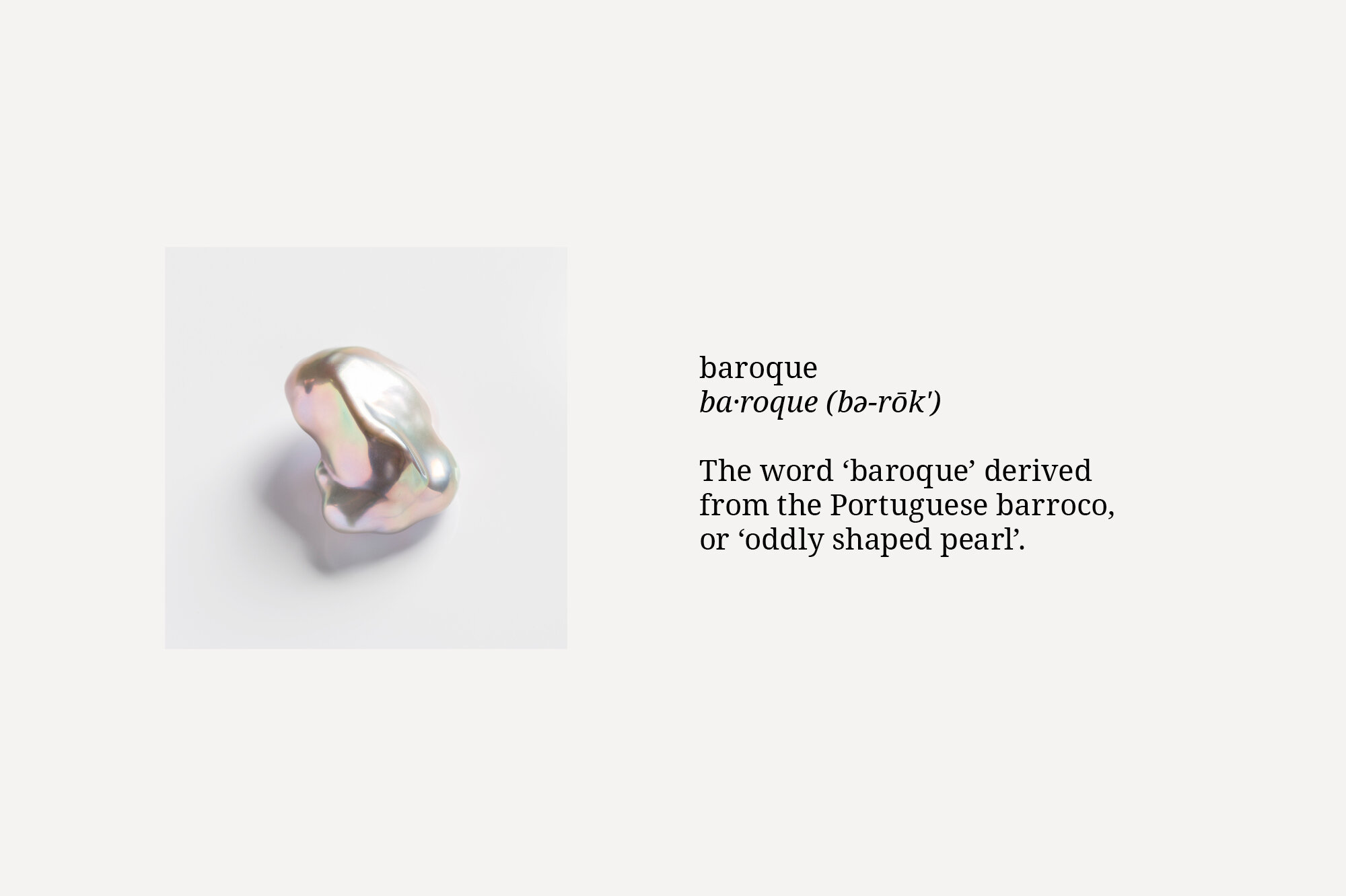
A brand identity for Manchester Baroque, a new musical group dedicated to performing 17th and 18th century music. The identity is inspired by the origin of the word Baroque, derived from the Portuguese word barroco meaning ‘misshapen pearl’.
Inspired by a ‘misshapen pearl’, the brand identity incorporates uniquely shaped letter ‘O’s throughout the brand, each one slightly different. The colour palette is also inspired by the many colours of a pearl.